Welcome to our new identity.
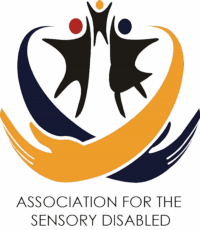
We have changed our corporate logo, corporate colours and the “look and feel” of our website. This was done as we felt our previous brand visual identity was too rigid and not effectively conveying the essence of our business – which is first and foremost: WE CARE.
The Association for the Sensory Disabled is a caring organisation that provides shelter, care, treatment and educational opportunities for the children with special needs. Physical and attitudinal barriers, coupled with stereotypes play a large role in shaping public perceptions about persons with special needs. Most of these notions are based on preconceived ideas, which include shame and feelings of obligation toward a child with special needs. It has been noted that positive interactions when raising a child with special needs had a significant moderating effect on the relationship between the child and parental well-being.
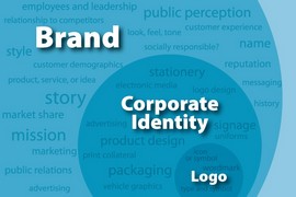
Hence our corporate identity has a primary goal of community relations – an outreach programme for the purpose to maintain and build a brand identity that accord with and facilitate the corporate business objectives. The corporate identity is typically visualized by way of encapsulating our service offering in a more expressive trademark, but will eventually extend to include things like publications, profiles product design, advertising, public relations etc.. .
We are at the first stages of developing a proper Corporate Identity Manual which will guide the application of changing to a logotype [instead of the logogram] and supporting devices commonly assembled within a set of corporate guidelines. These guidelines will govern how the identity is applied and usually include approved colour palettes, typefaces, page layouts, fonts, and others.
Our aim is to develop a set of multi-sensory elements that communicate a core visual statement about the brand to consumers, sponsors, health and research organisations and government alike. By establishing brand consonance, we will offer unified messaging to consumers from all fronts of the organisation and in alignment of all touch points.
We have appointed a brand consultancy to assist us with re-positioning our brand visual identity on two levels: Integrated Marketing Communication; and taking cognizance of developments in Neuro-marketing in an attempt to raise our brand equity. Funding remains a key requirement of our business as we receive very little government funding and are reliant on sponsors and donar organisations to assist us to provide quality care to the disabled children in our community.
We believe our new corporate visual identity will play a significant role in the way the organization presents itself to both internal and external stakeholders. In general terms, our corporate visual identity will more effectively express the values and ambitions of ASD, its business, and its characteristics.
Our new colours are representative of our dreams and aspirations:
- Our primary colour is Intense blue: Blue is a colour that depicts stability – the stability we offer destitute children. Blue is associated with peace, water, tranquility, and reliability. It provides a sense of security, and stimulates productivity. The most basic colour to promote trust in the level of services we offer.
- Our secondary colour is Golden Yellow – Yellow represents the drive and aspirations of our children. Yellow is a vibrant colour, filled with optimism, hope and dreams of an unlimited future. All children have dreams; all children have aspirations – and rightfully so.We aim to develop our children to their fullest possible potential.
- We use Black – Associated with authority, power, stability, and strength. Often a symbol of intelligence, but a unifying colour that all people find easy to relate to.
- We also use Red as an accent: Red creates a sense of urgency and physically stimulates the body, raising blood pressure and heart beat; associated with movement, excitement, and passion. Red personifies or passion for the work we do; our love for the children we care for.
Please let us know how you experience our new brand visual identity.


Recent Comments